JN films
 03-06-2006, 04:22 PM
#1
TECH Fanatic
Thread Starter
iTrader: (1)
Join Date: Jul 2005
Location: houston tx
Posts: 1,244
Likes: 0
Received 0 Likes
on
0 Posts

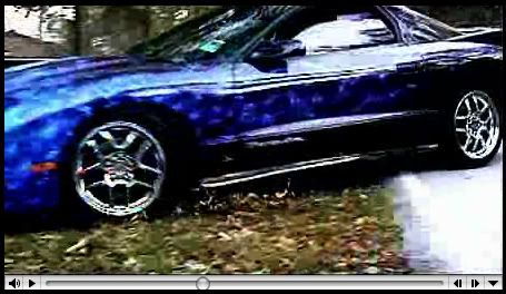
check out the film we made...its called "retrieve" made it over spring break! we had a blast doing it. If you have time, watch "The Case" we filmed it a LOOOOOONG time ago...if you notice its all the same characters...only older lol...it kinda fits together "The Case" is part one and "Retrieve" is part two...so watch "The Case" first...ok ill stop talking now...enjoy
www.jnfilms.com
heres a screenshot
www.jnfilms.com
heres a screenshot
 03-07-2006, 09:00 PM
#3
I watched it ... a couple critical comments ...
Character development. It wasn't clear who the good guys were or the bad guys. Not sure who the guy was driving the Grand Prix. Too many characters without the audience having a way to identify each of them.
You tried by showing the guy driving the TA and the cop in the TB, but you used too much back light to distinguish unique facial features.
Also, all the characters were dressed too similarly.
And who was the innocent by-stander that got shot ... you know, the poor, token black guy? Be careful who you cast in what role. If you want a wide audience, you can't alienate a whole group of folks.
Ever notice in real movies how the good guys and bad guys are easily distinguished by obvious differences, either in wardrobe, age, hair style, something immediately obvious.
So there is this raging 3 way gun battle and folks are standing upright, trying to hide behind twigs and 30 feet away and noone gets a scratch.
Dude takes off running and gets nailed with a single shot from what appears hundreds of yards away.
And why was he running?
Use wide establishing shots in close quarters to keep the audience oriented as to who is where and doing what. Use the close cut shots to make the distances seem smaller than they are.
Production technique was good. Art direction was nice .. nice contrasting colors to help the audience see the actors "pop" from the back ground. Also, nice use of daylight to keep everything straight. Continuity in lighting is the first thing that audiences notice that something is wrong, but can't tell what it is. Nice detail.
Leaves strewn on the road to enhance the affect of speed. However, the camera should've been a little lower to help that illusion along.
I realize it was low budget and a short film. But, if you are gonna stick your neck out and ask, someone is gonna tell you how it is.
BTW ... I graduated 30 years ago with an art degree and have been in the RTF business since 1982.
You haven't edited till you've cut 16mm film ...
Premeire Pro can make anyone an editor ...
03-07-2006, 09:15 PM
#4
TECH Addict
iTrader: (10)
Join Date: Oct 2004
Location: TheNew home of the Cowboys
Posts: 2,339
Likes: 0
Received 0 Likes
on
0 Posts
it's cool, but one question why you have to randomly kill the black dude, that was hilarious 3 white guys and a random black guy riding a bike gets sniped. 
03-12-2006, 09:26 PM
#5
TECH Fanatic
Thread Starter
iTrader: (1)
Join Date: Jul 2005
Location: houston tx
Posts: 1,244
Likes: 0
Received 0 Likes
on
0 Posts
Originally Posted by mitchntx
I watched it ... a couple critical comments ...
Character development. It wasn't clear who the good guys were or the bad guys. Not sure who the guy was driving the Grand Prix. Too many characters without the audience having a way to identify each of them.
You tried by showing the guy driving the TA and the cop in the TB, but you used too much back light to distinguish unique facial features.
Also, all the characters were dressed too similarly.
And who was the innocent by-stander that got shot ... you know, the poor, token black guy? Be careful who you cast in what role. If you want a wide audience, you can't alienate a whole group of folks.
Ever notice in real movies how the good guys and bad guys are easily distinguished by obvious differences, either in wardrobe, age, hair style, something immediately obvious.
So there is this raging 3 way gun battle and folks are standing upright, trying to hide behind twigs and 30 feet away and noone gets a scratch.
Dude takes off running and gets nailed with a single shot from what appears hundreds of yards away.
And why was he running?
Use wide establishing shots in close quarters to keep the audience oriented as to who is where and doing what. Use the close cut shots to make the distances seem smaller than they are.
Production technique was good. Art direction was nice .. nice contrasting colors to help the audience see the actors "pop" from the back ground. Also, nice use of daylight to keep everything straight. Continuity in lighting is the first thing that audiences notice that something is wrong, but can't tell what it is. Nice detail.
Leaves strewn on the road to enhance the affect of speed. However, the camera should've been a little lower to help that illusion along.
I realize it was low budget and a short film. But, if you are gonna stick your neck out and ask, someone is gonna tell you how it is.
BTW ... I graduated 30 years ago with an art degree and have been in the RTF business since 1982.
You haven't edited till you've cut 16mm film ...
Premeire Pro can make anyone an editor ...
Character development. It wasn't clear who the good guys were or the bad guys. Not sure who the guy was driving the Grand Prix. Too many characters without the audience having a way to identify each of them.
You tried by showing the guy driving the TA and the cop in the TB, but you used too much back light to distinguish unique facial features.
Also, all the characters were dressed too similarly.
And who was the innocent by-stander that got shot ... you know, the poor, token black guy? Be careful who you cast in what role. If you want a wide audience, you can't alienate a whole group of folks.
Ever notice in real movies how the good guys and bad guys are easily distinguished by obvious differences, either in wardrobe, age, hair style, something immediately obvious.
So there is this raging 3 way gun battle and folks are standing upright, trying to hide behind twigs and 30 feet away and noone gets a scratch.
Dude takes off running and gets nailed with a single shot from what appears hundreds of yards away.
And why was he running?
Use wide establishing shots in close quarters to keep the audience oriented as to who is where and doing what. Use the close cut shots to make the distances seem smaller than they are.
Production technique was good. Art direction was nice .. nice contrasting colors to help the audience see the actors "pop" from the back ground. Also, nice use of daylight to keep everything straight. Continuity in lighting is the first thing that audiences notice that something is wrong, but can't tell what it is. Nice detail.
Leaves strewn on the road to enhance the affect of speed. However, the camera should've been a little lower to help that illusion along.
I realize it was low budget and a short film. But, if you are gonna stick your neck out and ask, someone is gonna tell you how it is.
BTW ... I graduated 30 years ago with an art degree and have been in the RTF business since 1982.
You haven't edited till you've cut 16mm film ...
Premeire Pro can make anyone an editor ...
