


Attn Slowhawk Crew
I don't put decals on my car but if I were to, the Hawk holding the Wrench would probably be the one. Who knows, maybe the final design will make it onto my CF radiator shroud. Regardless, good creativity Dan, keep up the good work!
Todd
Why dont you see how it looks to make both words grey, remove the backround on the bottom word but keep everything else as is. The bottom grey backround is a big, sharp edged solid void. It takes away from how clean and neat looking everything else is.
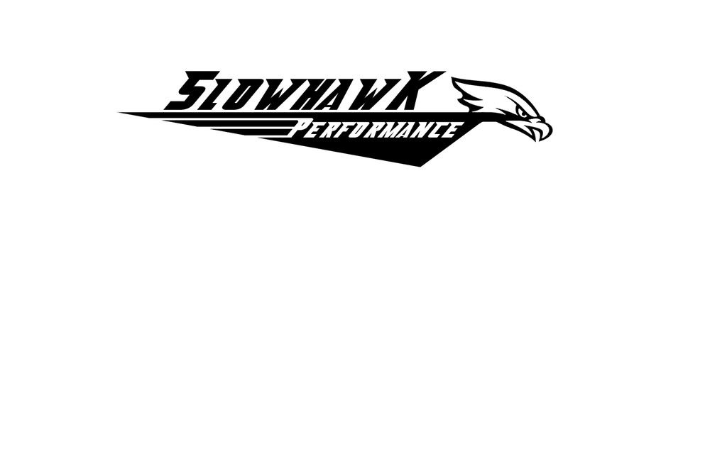
I like the logo alot, it's something new, clean and not tacky.
I like the logo alot, it's something new, clean and not tacky.
The Hawk w/ the wrench is something I tried and ultimately kinda gave up on. Remember this is no color, just a vinyl outline. Maybe with a lot of time i could get it to work but it's tough. To give you an idea...

see what I mean.
Thanks for more input though. I made a few alterations let me know what you think.

Kinda digging this one!
And just for ***** n' giggles. A different design...

see what I mean.
Thanks for more input though. I made a few alterations let me know what you think.
Kinda digging this one!
And just for ***** n' giggles. A different design...
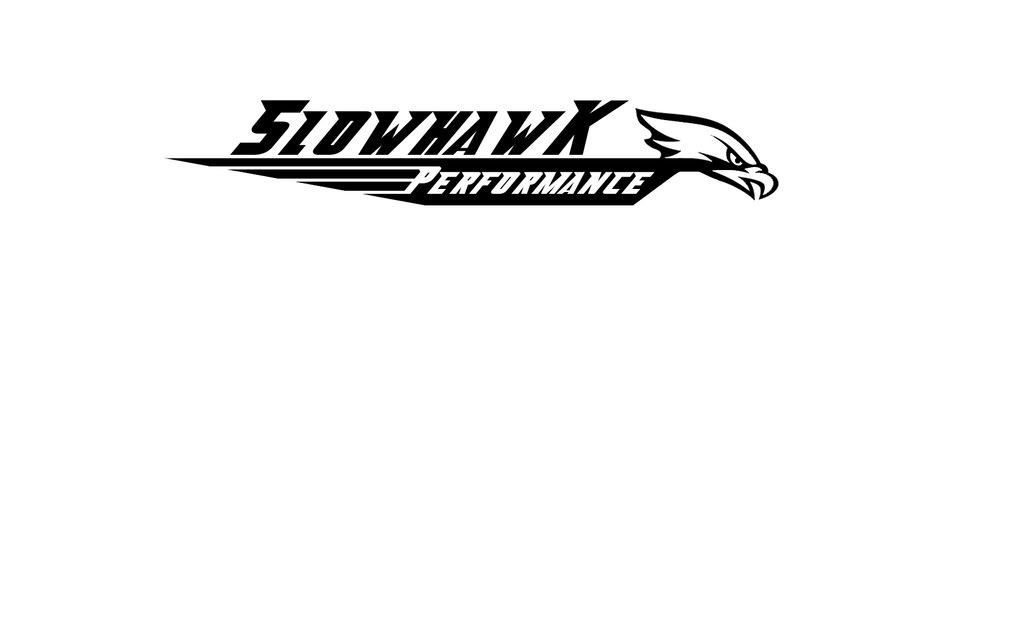
I like #3 alot. The bottom black triangle section is gone and the three white lines on the left break up the solid black alot.
Nice.
BTW, the is similar to the high school mascot image. Goooooo ROXBURY, MA!
Nice.
BTW, the is similar to the high school mascot image. Goooooo ROXBURY, MA!
I figured if I cut the tip off the bottom it might be better in a banner form too. I see pro's and cons for the point at the bottom.
Yeah that last one a friend threw together. I though it was presentable.
LS1 Tech Stories
The Best V8 Stories One Small Block at Time
Amazing '71 Camaro Restomod Is Modern Muscle Car Under the Skin
Verdad Gallardo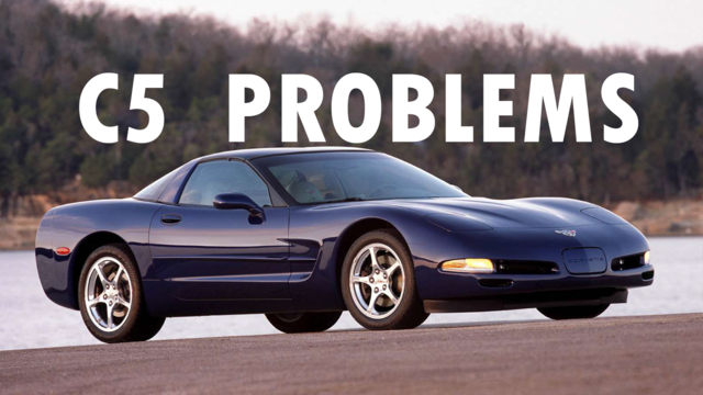
6 Common C5 Corvette Failures and What's Involved In Repairing Them
Pouria Savadkouei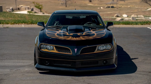
Retro Modern Bandit Pontiac Trans AM Comes With Burt Reynolds' Autograph
Verdad Gallardo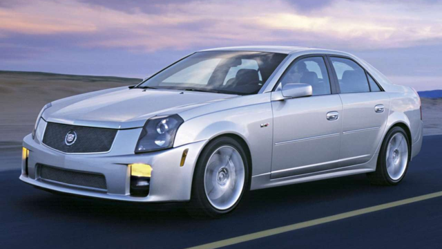
Top 10 Greatest Cadillac V Series Performance Models Ever, Ranked
Pouria Savadkouei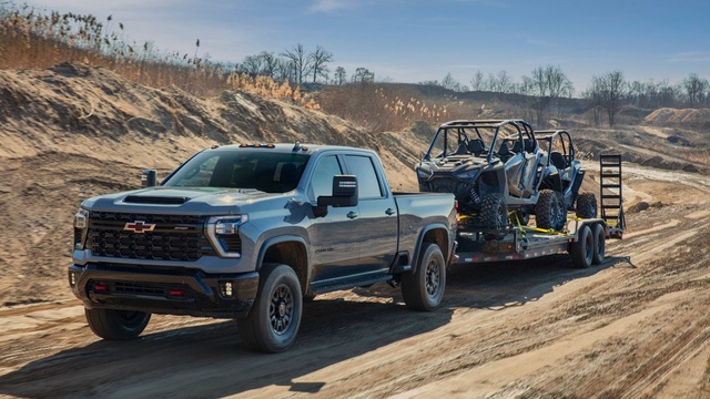
Top 10 Most Powerful Chevy Trucks Ever Made!
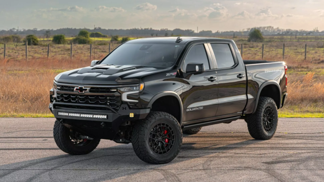
Hennessey's New Supercharged Silverado ZR2 Has 700 HP
Verdad Gallardo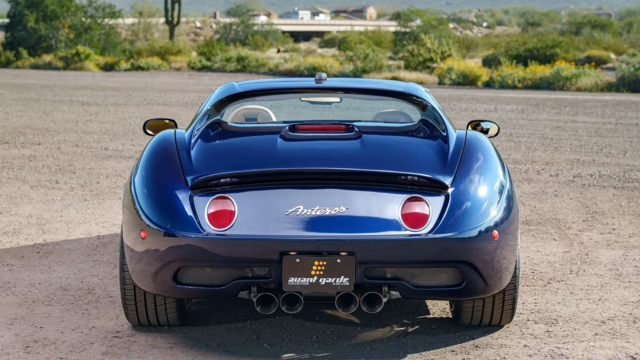
Coachbuilt N2A Anteros Is an LS2-Powered C6 Corvette In Italian Clothes
Verdad Gallardo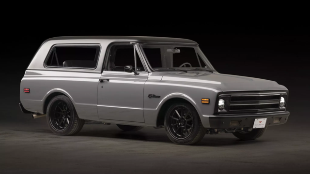
Awesome K5 Blazer Restomod Comes With C7 Corvette Power
Verdad Gallardo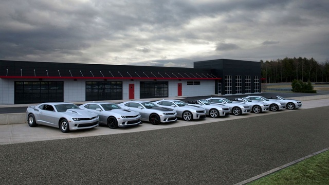
10 Camaros You Should Never Buy

Good thanks guys.
Lets see if we get a little more feedback/advice before I get back to Tom.
I was thinking about making the lines off the P either slightly thicker or having them not connect to the P, slightly staggered. But yeah the more I look at it the more I like the 3rd so far.
Lets see if we get a little more feedback/advice before I get back to Tom.
I was thinking about making the lines off the P either slightly thicker or having them not connect to the P, slightly staggered. But yeah the more I look at it the more I like the 3rd so far.
LS1TECH Sponsor
Joined: Dec 2001
Posts: 3,310
Likes: 0
From: I'm glad one of us finds this amusing...
Number 3 gets my vote! Hook that up with some pics on the windshield and the side. I love it when a good thing comes together.
Dan great work! Thanks for being open minded about all the feedback, and putting it to good use.
Dan great work! Thanks for being open minded about all the feedback, and putting it to good use.


Alright looks like Tom is gonna give the #3 a try on the machine.
Smallest emblem is 2" x 11.5", should be perfect for the side hatch. well see.
I'll try to Photoshop some banners on the car later so we can see how it looks.
Smallest emblem is 2" x 11.5", should be perfect for the side hatch. well see.
I'll try to Photoshop some banners on the car later so we can see how it looks.


