


Graphics - Would this look good?
Originally Posted by PendragonZ
Well hrm, I still like it for a drag car.
For those that don't like, is there any thing you would change to
make it different? (other than no graphics)

I hate how everyone is so pigeon-holed into thinking that
graphics = rice. Why is this so? Do you consider anything
other than a paint job rice? What about factory vinyl?
Is the 35th edition rice because it has vinyl stickers?
Granted, if you have some anime looking graphic, this could be
over the top, but flames, stripes, simple designs, why does this
get labeled rice?
Yes, my opinion is biased. I like graphics. That is why I work
with them.
For those that don't like, is there any thing you would change to
make it different? (other than no graphics)
I hate how everyone is so pigeon-holed into thinking that
graphics = rice. Why is this so? Do you consider anything
other than a paint job rice? What about factory vinyl?
Is the 35th edition rice because it has vinyl stickers?
Granted, if you have some anime looking graphic, this could be
over the top, but flames, stripes, simple designs, why does this
get labeled rice?
Yes, my opinion is biased. I like graphics. That is why I work
with them.
I guess the bland cut from red to silver back to red, with no subltle transtion (ala the 35th ann'y) is killing it for me. Granted I know it is a chop job, but it looks like a big huge sticker that got slapped on. Yes I know our lovely freinds from 2F2F have messed up the desire for graphics - but noone actually "said" said rice.
What if the stripe transitioned the car into two colors, red to say dark metallic grey. That could be cool, almost like a red car tearing its way out of a black or grey body?
Last edited by Xsta Z 28; Nov 20, 2003 at 03:03 PM.
Thread Starter
Joined: Nov 2001
Posts: 45,329
Likes: 1,767
From: Chicago, IL
Pend, how about "LS1TECH" lettering like the Brembo letting on that 350Z car.
FWIW, I think some imports look cool, just imagine how cool it would be to look cool and be twice as fast as them. Most of the time I have a concern that sometimes this forum is quick to follow trends but not to stretch a little and try new stuff... I like the retro stuff and the stripes and the flames but how is that stuff not dated?
FWIW, I think some imports look cool, just imagine how cool it would be to look cool and be twice as fast as them. Most of the time I have a concern that sometimes this forum is quick to follow trends but not to stretch a little and try new stuff... I like the retro stuff and the stripes and the flames but how is that stuff not dated?
I also think some imports look cool and I have NOTHING against graphics. If I had gotten a Z28 instead of the TA I had planned on getting an NBM car and putting a very large bowtie aloong the side at a 45* angle up and onto the rear window. Some people don't like that but I don't care I wanted it to look like a race car would.
If you want graphics maybe do something along the lines of identifying the car with them
A large Arrowhead or a Pheonix with Formula or Firebird in them or even LS1TECH.com.
The splash graphics just seem too generic too me.
If you want graphics maybe do something along the lines of identifying the car with them
A large Arrowhead or a Pheonix with Formula or Firebird in them or even LS1TECH.com.
The splash graphics just seem too generic too me.
To me, if you got graphics, i'd do a Firebird theme or something like that (like the concept wagon that had the Trans Am bird along the side...something like that).
I dont think that graphic is too horrible, but i dont like it. Ya need something thats more menacing, and intimidating, imo then that. It doesnt look bad, but its not something i like...and Pen, you did a good job :p
I dont think that graphic is too horrible, but i dont like it. Ya need something thats more menacing, and intimidating, imo then that. It doesnt look bad, but its not something i like...and Pen, you did a good job :p
LS1 Tech Stories
The Best V8 Stories One Small Block at Time
6 Common C5 Corvette Failures and What's Involved In Repairing Them
Pouria Savadkouei
Retro Modern Bandit Pontiac Trans AM Comes With Burt Reynolds' Autograph
Verdad Gallardo
Top 10 Greatest Cadillac V Series Performance Models Ever, Ranked
Pouria Savadkouei
Top 10 Most Powerful Chevy Trucks Ever Made!
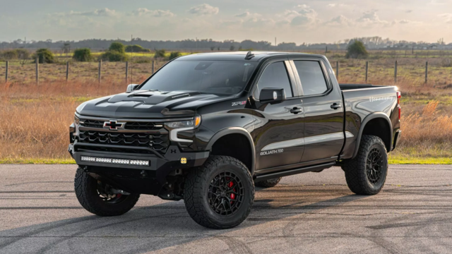
Hennessey's New Supercharged Silverado ZR2 Has 700 HP
Verdad Gallardo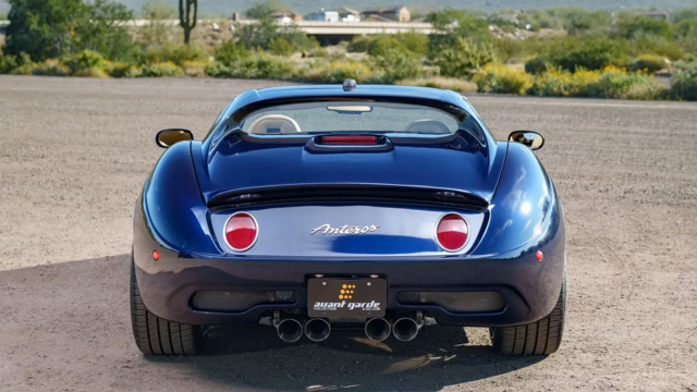
Coachbuilt N2A Anteros Is an LS2-Powered C6 Corvette In Italian Clothes
Verdad Gallardo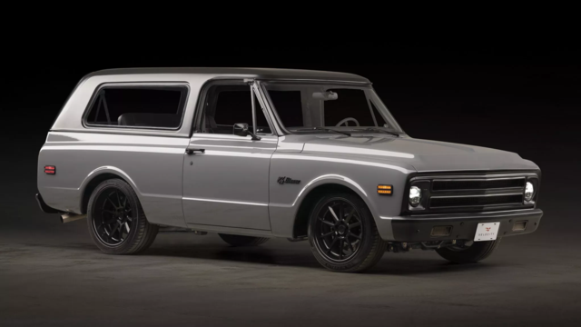
Awesome K5 Blazer Restomod Comes With C7 Corvette Power
Verdad Gallardo
10 Camaros You Should Never Buy
10 LS Engine Myths That Refuse to Die
Verdad Gallardo
that looks a lot better with letters on the middle, it was just too bid of a spot without any breakup on it, plus earlier, i thought it was also a street\strip car, so yea do the graphics, just do some type of lettering IMO..
Here ya go, PSJ
I think the "lettering" would look better, if it was the same as the logo on the LS1tech stickers and shirts, etc
have those, just like the decals, where they are diecut, so the letters are actually the paint, and cut out from the graphics
I think the "lettering" would look better, if it was the same as the logo on the LS1tech stickers and shirts, etc
have those, just like the decals, where they are diecut, so the letters are actually the paint, and cut out from the graphics


TECH Fanatic
Joined: Dec 2001
Posts: 1,182
Likes: 0
I love this site but slapping the ls1tech name on a car is just a little too  for me...sorry guys but that whole scheme is terrible IMO....I would stick to the flames in the front like if a car a different color was coming out of its shell....anyways I guess it all comes down to what you actually like PSJ, you are the one who is going to be driving the thing everyday....and please hurry and get that hood painted hehehe
for me...sorry guys but that whole scheme is terrible IMO....I would stick to the flames in the front like if a car a different color was coming out of its shell....anyways I guess it all comes down to what you actually like PSJ, you are the one who is going to be driving the thing everyday....and please hurry and get that hood painted hehehe 
Administrator

Joined: Jan 2002
Posts: 45,841
Likes: 5
From: Earth
I don't like any of the above graphics PSJ, sorry. I do like the idea of the LS1Tech logo though. Maybe not so big though. It would be ricey to put the logo on a car except yours, Tony's, and Stephen's.
Baby steps, baby steps, PSJ. Hood first, then graphics.
Seriuously, I like the look that Jay Johnson has going on (I can't find any pics right now), I would wrap the color around the back of the car, and skip the logo, IMO.
Seriuously, I like the look that Jay Johnson has going on (I can't find any pics right now), I would wrap the color around the back of the car, and skip the logo, IMO.
Thread Starter
Joined: Nov 2001
Posts: 45,329
Likes: 1,767
From: Chicago, IL
I appreciate the feedback.
I do not like flames, or Pontiac 'bird' related graphics, I have too many friends who have done flames so I need to be different.
I do not like flames, or Pontiac 'bird' related graphics, I have too many friends who have done flames so I need to be different.