need some photoshop critique
Well i just started using photoshop and could use some feed back on how im doing. So far ive only done 3 sigs i will post them below and would like to know what i can do to make my work better, what you see i did wrong, ect.
not going to post the first one i did because its horrible
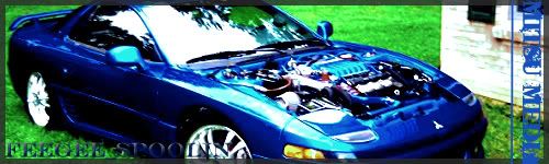
2nd one
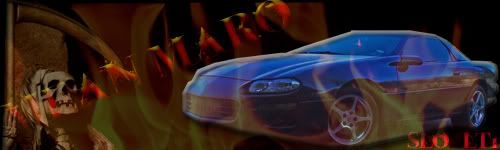
3rd..and my favorite
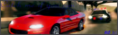
wish i could have used my own car for this one but i didnt have the right pic.
let me know what you guys think, is my work absolutely ? kinda good? keep in mind ive only done three projects so far
not going to post the first one i did because its horrible
2nd one
3rd..and my favorite
wish i could have used my own car for this one but i didnt have the right pic.
let me know what you guys think, is my work absolutely
? kinda good? keep in mind ive only done three projects so far that's what i was originally going for but it didnt look "video gamish" enough maybe ill try that one again
Trending Topics
3rd one really is that bad for a beginner. Just keep practicing and you'll get better each and every one that you do. Some of my first ones were just plain awful as well. So keep up the good work....
LS1 Tech Stories
The Best V8 Stories One Small Block at Time

Gas Monkey Built a 6-Wheel Ferrari Testarossa With a Corvette LT4 Engine
Verdad Gallardo
7 Most Reliable High-Performance Engines GM Has Ever Built
Verdad Gallardo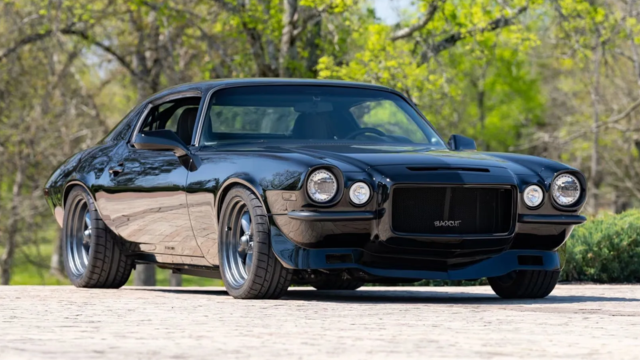
Amazing '71 Camaro Restomod Is Modern Muscle Car Under the Skin
Verdad Gallardo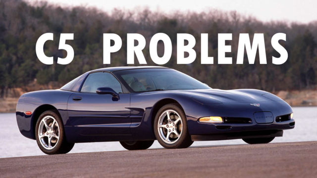
6 Common C5 Corvette Failures and What's Involved In Repairing Them
Pouria Savadkouei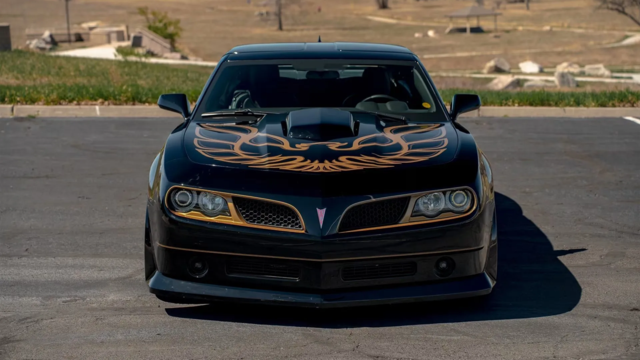
Retro Modern Bandit Pontiac Trans AM Comes With Burt Reynolds' Autograph
Verdad Gallardo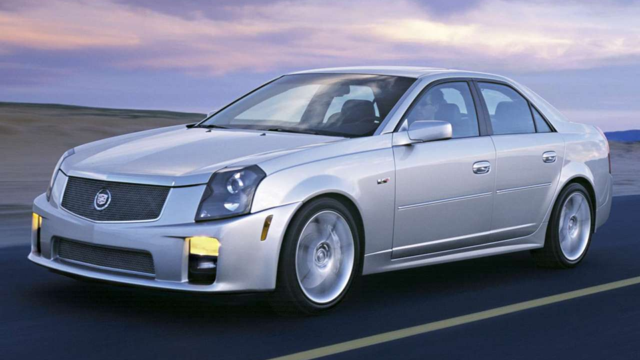
Top 10 Greatest Cadillac V Series Performance Models Ever, Ranked
Pouria Savadkouei
Top 10 Most Powerful Chevy Trucks Ever Made!
Hennessey's New Supercharged Silverado ZR2 Has 700 HP
Verdad Gallardo
Coachbuilt N2A Anteros Is an LS2-Powered C6 Corvette In Italian Clothes
Verdad Gallardo i think you coulda layered over the camaro with the flames so you dont see that shadow line on the bottom and maybe brightened up the flames a little bit. Its all dark and kinda run-together. Fix that and i think it would look pretty good.
TECH Regular
Joined: Jul 2009
Posts: 426
Likes: 0
From: MOV
Don't use complicated script text over pictures. It washes out. Using filters like Eye Candy that does things for you often gives off generic looks.
Embosses fonts are kinda passe now. When using drop shadow, don't make it so visible and large. Make it something one doesn't see at first.
Also, when using colors, more isn't always better. Most designs I do have 3 colors tops.
Make sure those colors compliment each other.
This is one of the most bad-assed web pages for trying out different color schemes.
I use it at work every day.
http://www.colorjack.com/sphere/
ANOTHER great tool for figuring out what font something is ..
http://new.myfonts.com/WhatTheFont/
Also, most any Photoshop tutorial on the web does a great job teaching you the basics.
I've been using Photoshop since 2.0 first came out. I had the advantage of being able to learn each new feature with each upgrade. I feel sorry for anyone JUST starting to use it now.
TECH Regular
Joined: Jul 2009
Posts: 426
Likes: 0
From: MOV
ALSO if you are using web images for say.. sigs. And you want to use transparencies, "Save to web" in Photoshop and save as a transparent PNG. it has thousands of layers of transparency and you can use the image in any background.
Check out my sig. It's a transparent PNG. Notice that no matter what the background is, the drop shadow matches it.
Having said that, PNGs don't do animation YET. That's why I made my avatar as a gif image. (Well the original one is animated. Which isn't allowed here. )

Anyone that has, or had a NewEdge gets the joke. Ford should have had Traction Control off by default, and let the switch turn it on. It's on by default, and the switch turns it off.
Check out my sig. It's a transparent PNG. Notice that no matter what the background is, the drop shadow matches it.
Having said that, PNGs don't do animation YET. That's why I made my avatar as a gif image. (Well the original one is animated. Which isn't allowed here. )
Anyone that has, or had a NewEdge gets the joke. Ford should have had Traction Control off by default, and let the switch turn it on. It's on by default, and the switch turns it off.
I think you may be trying too hard. The trick behind the most standout graphics is moderation. Just because you can do something, doesn't mean you should. Whenever you're making a graphic you want to remember that not everyone has as fast of a connection as you might. If the graphic is complex, it will probably be a large file that takes a while to download on a slow connection. Then people get annoyed. Also, you generally want something simply with that's highly recognizible. You can pretty much apply those simple rules-of-thumb to sigs.
Oh, and KISS stands for "Keep it simple stupid."
Oh, and KISS stands for "Keep it simple stupid."

The basics of Photoshop since day 1 have been mastering which tools to use to create quick and accurate selections. Once you get this down the rest is just creative experimentation. If you have an artistic eye for layout and design, everything else will come in time. I like the last one posted, the first is too busy and the selection of the car looks awkward.
Thank you all for your help, i aspire to be a graphic designer in the near future so im practicing all the time. thanks "Ke^in" for showing me those site i will definitely be frequenting them.As i continue to learn i will be posting more of my work
-Nate
-Nate


TECH Regular
Joined: Jul 2009
Posts: 426
Likes: 0
From: MOV
Don't let it get overwhelming to you. I am decent at it, but I've seen sites that just make me sick at the work they do.
Make sure to work with CMYK for print, and RGB for web also. Too many people send web graphics for print work. It makes me want to
Make sure to work with CMYK for print, and RGB for web also. Too many people send web graphics for print work. It makes me want to