Webdesigners, input needed
Thread Starter
TECH Senior Member
iTrader: (10)
Joined: Nov 2001
Posts: 8,766
Likes: 0
From: Gainesville, Denton TX
Give this one a quick once over.
www.budlightxposed.com
Don't hold back now, let me know your true thoughts.
I didn't design it, though I will be shortly, as a new project.
Some suggestions, or hell something to base it off of wouldn't hurt.
My eyes, and sanity need your help.
www.budlightxposed.com
Don't hold back now, let me know your true thoughts.
I didn't design it, though I will be shortly, as a new project.
Some suggestions, or hell something to base it off of wouldn't hurt.
My eyes, and sanity need your help.
to start you could make it so you dont have to scroll left to right...just for that little amount of space....annoying somtimes when you have to read or look at something and it's just alittle off of the screen
Launching!
Joined: Dec 2003
Posts: 260
Likes: 0
From: Palm Bay, Florida
A basic rule of thumb is that you want to keep the content around 800 x 600 pixels. Of course the length will vary depending on how much content is put into the page.
Here are some examples of what I mean.
http://www.cisco.com/
http://www.msn.com/
Notice how Cisco kept the basic rule while MSN kept the width rule but let the content go as far down as needed. Also notice how MSN kept the content centered while Cisco kept it left justified. I prefer to center my content.
Just by reformatting your site like this will help ALOT when people look at it. Also I think I can see the border on the beer hover overs. Set the border to zero to get rid of that. Change the picture viewing method. I don't like the load time on it. Keep it simple.
Last edited by jrivera04; Aug 8, 2006 at 04:08 PM.
Thread Starter
TECH Senior Member
iTrader: (10)
Joined: Nov 2001
Posts: 8,766
Likes: 0
From: Gainesville, Denton TX
Oh, the photo gallerys suck horribly. I'd settle for a simple photoshop made thumbnail gallery at this point.
I'm going to design a little jpg and post it up later tomorrow (or or today) for an idea. I'm no web designer, just do graphics here.
I just want something upscale looking, compared to something similar to what a 13 yearold would put up on geocities. This is based towards a college town, (denton - Univerisity of North Texas) and the surrounding areas. It needs to have a good feel that someone would actually go back to. As it sits now, I highly doubt anyone would check it or even try to navigate it much more than once.
Trending Topics
Thread Starter
TECH Senior Member
iTrader: (10)
Joined: Nov 2001
Posts: 8,766
Likes: 0
From: Gainesville, Denton TX
Originally Posted by Mavmavv
Blind people even hate that site.
Seriously. Dont use ANYTHING off the old site.
Seriously. Dont use ANYTHING off the old site.
might pull something from here, though no idea what to go with.
http://www.oswd.org/designs/browse/
LS1 Tech Stories
The Best V8 Stories One Small Block at Time

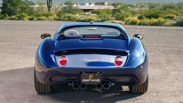
Gas Monkey Built a 6-Wheel Ferrari Testarossa With a Corvette LT4 Engine
Verdad Gallardo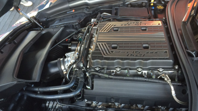
7 Most Reliable High-Performance Engines GM Has Ever Built
Verdad Gallardo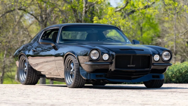
Amazing '71 Camaro Restomod Is Modern Muscle Car Under the Skin
Verdad Gallardo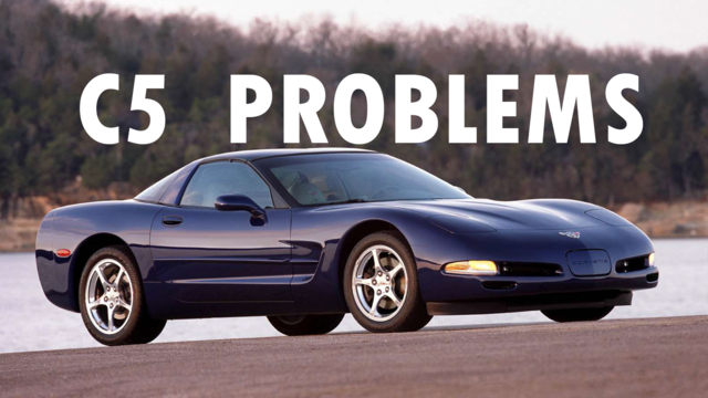
6 Common C5 Corvette Failures and What's Involved In Repairing Them
Pouria Savadkouei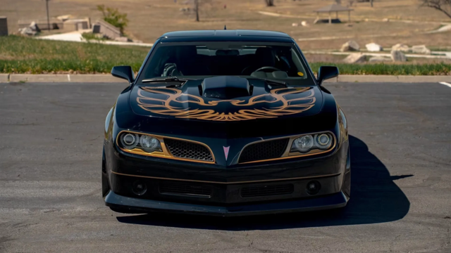
Retro Modern Bandit Pontiac Trans AM Comes With Burt Reynolds' Autograph
Verdad Gallardo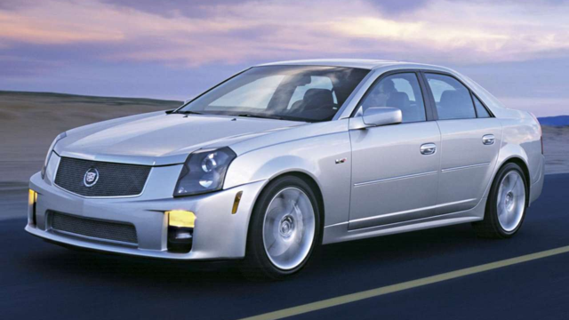
Top 10 Greatest Cadillac V Series Performance Models Ever, Ranked
Pouria Savadkouei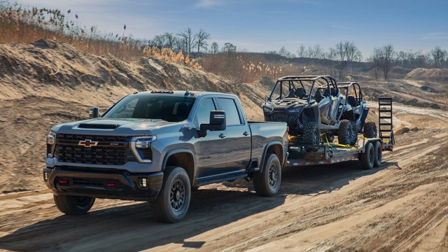
Top 10 Most Powerful Chevy Trucks Ever Made!
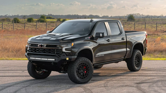
Hennessey's New Supercharged Silverado ZR2 Has 700 HP
Verdad Gallardo