

How to tune LTrims using LS1 Edit ???

TECH Addict
Joined: Nov 2001
Posts: 2,207
Likes: 0
From: College Station, Tx
Here is an example of how I would do it, using the source data emailed me.
http://www.slowcar.net/shared/correctedmaf.xls
I started out on the "Source Data" page - first I averaged the l-trim values from left to right, then converted them to a percent. I then applied that percent correction to the airflow values.
Next I made a pivot table (on Final Data sheet) based on the airflow vs. MAF frequency. I grouped this in as small incriments as I could and averaged the values for each cell. I then moved this data to a static table, averaging the range of frquency values.
I next did a curve fit on that data and displayed both the raw data and curve fit on the "Graph" page. 5th order worked the best (no sigmoid anomalies in the beginning).
Excel does not use enough significant digits for our purposes when displaying equations, so I used a separate software package (Dplot) to determine the proper curve fit - again using 5th order. You can use whatever software package you desire to do this (or even a handheld calculator will work well).
I then synthesized a MAF table using the stock frequency points based on the curve fit, and plotted that on the table. You can not how closely it co-incides with the trendline/curve-fit for the raw data, indicating a good function. The correlation value (R) was also displayed.
Chris

Teching In
Joined: Mar 2002
Posts: 33
Likes: 0
From: ALABAMA
Oh yeah...I do that all the time <img border="0" title="" alt="[Smile]" src="gr_stretch.gif" /> Just wish I knew what that is. <img border="0" title="" alt="[Confused]" src="images/icons/confused.gif" /> Is there a course 101 for us Clingons? Or maybe an LS1edit for dumbies.
</font><blockquote><font size="1" face="Verdana, Helvetica, sans-serif">quote:</font><hr /><font size="2" face="Verdana, Helvetica, sans-serif">Originally posted by DUKE:
<strong>Oh yeah...I do that all the time <img border="0" title="" alt="[Smile]" src="gr_stretch.gif" /> Just wish I knew what that is. <img border="0" title="" alt="[Confused]" src="images/icons/confused.gif" /> Is there a course 101 for us Clingons? Or maybe an LS1edit for dumbies.</strong></font><hr /></blockquote><font size="2" face="Verdana, Helvetica, sans-serif">Very impressive analysis.
Looking quickly at the data, the rest of would use a linear adjustment (e.g. multiply the MAF table by 115 in Edit to push the LTrims slightly negative) and probably find that is sufficent, except at idle, and maybe bump the low MAF flows another 5% or so. <img border="0" title="" alt="[Wink]" src="gr_images/icons/wink.gif" />
<small>[ May 09, 2002, 08:56 AM: Message edited by: Ragtop 99 ]</small>
TECH Addict
Joined: Nov 2001
Posts: 2,207
Likes: 0
From: College Station, Tx
Ragtop99 - yep, I also would normally suggest just using a straight multiplier also - I would only use something like this when I simply can not keep the l-trims between -2 to -8 across the board.
Chris
Chris
</font><blockquote><font size="1" face="Verdana, Helvetica, sans-serif">quote:</font><hr /><font size="2" face="Verdana, Helvetica, sans-serif">Originally posted by Ragtop 99:
Looking quickly at the data, the rest of would use a linear adjustment (e.g. multiply the MAF table by 115 in Edit to push the LTrims slightly negative) and probably find that is sufficent, except at idle, and maybe bump the low MAF flows another 5% or so. <img border="0" title="" alt="[Wink]" src="gr_images/icons/wink.gif" /> [/QB]</font><hr /></blockquote><font size="2" face="Verdana, Helvetica, sans-serif">You would multiply the entire MAF table by 115%? What ranges are for the idle to increase it? Thanks.
Looking quickly at the data, the rest of would use a linear adjustment (e.g. multiply the MAF table by 115 in Edit to push the LTrims slightly negative) and probably find that is sufficent, except at idle, and maybe bump the low MAF flows another 5% or so. <img border="0" title="" alt="[Wink]" src="gr_images/icons/wink.gif" /> [/QB]</font><hr /></blockquote><font size="2" face="Verdana, Helvetica, sans-serif">You would multiply the entire MAF table by 115%? What ranges are for the idle to increase it? Thanks.
TECH Addict
Joined: Nov 2001
Posts: 2,207
Likes: 0
From: College Station, Tx
</font><blockquote><font size="1" face="Verdana, Helvetica, sans-serif">quote:</font><hr /><font size="2" face="Verdana, Helvetica, sans-serif">Originally posted by NastyC5:
<strong> understand how you averaged the L-trim from left to right however what did you do to convert them to a percent modifier?</font><hr /></blockquote><font size="2" face="Verdana, Helvetica, sans-serif"></strong>
If you click on a cell you can look at the formula I used. But that was simply dividing by 100 and adding 1.
</font><blockquote><font size="1" face="Verdana, Helvetica, sans-serif">quote:</font><hr /><font size="2" face="Verdana, Helvetica, sans-serif">How did you know to use this percent correction factor? </font><hr /></blockquote><font size="2" face="Verdana, Helvetica, sans-serif">
Fuel and air are added together in a constant ratio - so if I need 25 percent more fuel that means I should tell it I have 25 percent more air.
</font><blockquote><font size="1" face="Verdana, Helvetica, sans-serif">quote:</font><hr /><font size="2" face="Verdana, Helvetica, sans-serif"> I noticed the stock table and the modified table where you have a factor under each MAF frequency. Where did you derive these and how did you come up with them?</font><hr /></blockquote><font size="2" face="Verdana, Helvetica, sans-serif">
The value under each MAF frequency would be the airflow in g/sec - is that what you are referring to? The stock values just come from the program, and the modified values come from curve fitting the data (5th order polynomial) then plugging in the frequency data points to the formula.
Chris
</font><blockquote><font size="1" face="Verdana, Helvetica, sans-serif">quote:</font><hr /><font size="2" face="Verdana, Helvetica, sans-serif"> I couldn't multiply through my 120%, it maxed out the table, so I ddi 119.</font><hr /></blockquote><font size="2" face="Verdana, Helvetica, sans-serif">That is normal - when you have your table adjusted properlly you may end up maxing out the values at the end (high frequency) portion of the table. Just don't select them when you scale your table - you will end up with a "plateau" on the end of the graph. If you actually see these values then you can just compensate with the PE vs RPM table - but chances are you wont see airflow that great unless you are a FI vehicle.
Chris
<small>[ May 09, 2002, 01:28 PM: Message edited by: ChrisB ]</small>
LS1 Tech Stories
The Best V8 Stories One Small Block at Time

6 Common C5 Corvette Failures and What's Involved In Repairing Them
Pouria Savadkouei
Retro Modern Bandit Pontiac Trans AM Comes With Burt Reynolds' Autograph
Verdad Gallardo
Top 10 Greatest Cadillac V Series Performance Models Ever, Ranked
Pouria Savadkouei
Top 10 Most Powerful Chevy Trucks Ever Made!

Hennessey's New Supercharged Silverado ZR2 Has 700 HP
Verdad Gallardo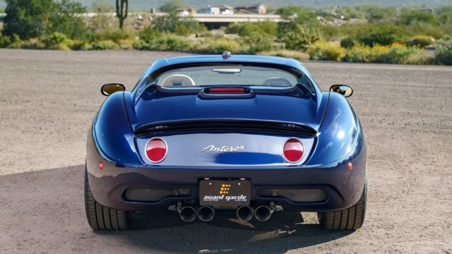
Coachbuilt N2A Anteros Is an LS2-Powered C6 Corvette In Italian Clothes
Verdad Gallardo
Awesome K5 Blazer Restomod Comes With C7 Corvette Power
Verdad Gallardo
10 Camaros You Should Never Buy
10 LS Engine Myths That Refuse to Die
Verdad Gallardo TECH Addict
Joined: Nov 2001
Posts: 2,207
Likes: 0
From: College Station, Tx
All these techniques are meant to be incrimental - e.g. one change wont do it - it's a repetitive process.
NastyC5 - looking at your results I would probably start with a scaling factor of 120% for the entire table - then drive around and not your l-trims, etc. - take it from there. Once you have them in the proper range - then you can use PE vs RPM to adjust your WOT values (which will now be different).
Chris
</font><blockquote><font size="1" face="Verdana, Helvetica, sans-serif">quote:</font><hr /><font size="2" face="Verdana, Helvetica, sans-serif">Originally posted by ChrisB:
<strong>I started out on the "Source Data" page - first I averaged the l-trim values from left to right, then converted them to a percent.</font><hr /></blockquote><font size="2" face="Verdana, Helvetica, sans-serif">I understand how you averaged the L-trim from left to right however what did you do to convert them to a percent modifier?
</font><blockquote><font size="1" face="Verdana, Helvetica, sans-serif">quote:</font><hr /><font size="2" face="Verdana, Helvetica, sans-serif">I then applied that percent correction to the airflow values.</font><hr /></blockquote><font size="2" face="Verdana, Helvetica, sans-serif">How did you know to use this percent correction factor?
</font><blockquote><font size="1" face="Verdana, Helvetica, sans-serif">quote:</font><hr /><font size="2" face="Verdana, Helvetica, sans-serif">Next I made a pivot table (on Final Data sheet) based on the airflow vs. MAF frequency. I grouped this in as small incriments as I could and averaged the values for each cell. I then moved this data to a static table, averaging the range of frquency values.
I next did a curve fit on that data and displayed both the raw data and curve fit on the "Graph" page. 5th order worked the best (no sigmoid anomalies in the beginning).
Excel does not use enough significant digits for our purposes when displaying equations, so I used a separate software package (Dplot) to determine the proper curve fit - again using 5th order. You can use whatever software package you desire to do this (or even a handheld calculator will work well).
I then synthesized a MAF table using the stock frequency points based on the curve fit, and plotted that on the table. You can not how closely it co-incides with the trendline/curve-fit for the raw data, indicating a good function. The correlation value (R) was also displayed.
Chris</strong></font><hr /></blockquote><font size="2" face="Verdana, Helvetica, sans-serif">The R value is excellent. I noticed the stock table and the modified table where you have a factor under each MAF frequency. Where did you derive these and how did you come up with them? You're an excellent math wiz. <img border="0" title="" alt="[Smile]" src="gr_stretch.gif" /> BTW, I couldn't multiply through my 120%, it maxed out the table, so I ddi 119.
<small>[ May 09, 2002, 12:44 PM: Message edited by: NastyC5 ]</small>
Chris, after I log some miles to get my L-trims learned how do I import my data to compare it to the curve of best fit drawn on the excel sheet? I know to avg the L-trims from left to right, find their percent + 1 for the multiplier if needed. Then for the MAF flow and Hz, where do I plug this info in for comparison? thanks.


</font><blockquote><font size="1" face="Verdana, Helvetica, sans-serif">quote:</font><hr /><font size="2" face="Verdana, Helvetica, sans-serif">Originally posted by ChrisB:
<strong> Fuel and air are added together in a constant ratio - so if I need 25 percent more fuel that means I should tell it I have 25 percent more air.
</strong></font><hr /></blockquote><font size="2" face="Verdana, Helvetica, sans-serif">So this takes effect for the MAF table, but what about the PE vs RPM table? Does that mean that if you scale your MAF 110% you could scale your PE vs RPM by 90% to put it back where it was before you scaled your MAF? I know this may not be the best thing, I am just talking conceptual here. It doesn't seem like this should be the case for the PE vs RPM table though.
<small>[ May 13, 2002, 04:39 PM: Message edited by: Nic00Z28M6 ]</small>
How can you apply the same formula to a whole group of cells, for instance to tell the cells to average their respective cells like Chris did with the Ltrims on the source data sheet?
TECH Addict
Joined: Nov 2001
Posts: 2,207
Likes: 0
From: College Station, Tx
Nic: I don't know if the PE vs RPM scales proportionally either. I don't believe it does though. I would start out with a small across the board change and look at results.
NastyC5: You can type the formula in one cell, then copy it, then highlight the remaining cells and past. Excel will automatically adjust the source data range for you.
Chris
NastyC5: You can type the formula in one cell, then copy it, then highlight the remaining cells and past. Excel will automatically adjust the source data range for you.
Chris
ChrisB, could you email me ominousvette@insightbb.com a step by step of making that pivot table and incorporating the data, I cna do all the things that you did on the source data page, just need help setting up the pivot table to give me a final answer.
TECH Addict
Joined: Nov 2001
Posts: 2,207
Likes: 0
From: College Station, Tx
Get the rows of data you want to have in the pivot table all next to each other, then highlight the entire selection. (It helps to label the top of each row and highlight this also.)
Now just got to Data -> Pivot Table Pivot Chart selection
It has a step by step wizard you can walk through to get the data on there.
Once you get it on there you need to group the x and y factor. Right click on one of the scaling axis and go to grouping. Group them by a range (either scale it like the pcm table, or get as many sampling poitns as you can. I believe the max is 256).
You will need to group both axis.
After that right click on the center data field, and go to field settigns. Change it from sum to average.
That should do it!
Chris
Launching!
Joined: Nov 2001
Posts: 236
Likes: 0
From: Memphis, TN
</font><blockquote><font size="1" face="Verdana, Helvetica, sans-serif">quote:</font><hr /><font size="2" face="Verdana, Helvetica, sans-serif">Originally posted by ChrisB:
<strong>Here is an example of how I would do it, using the source data emailed me.
http://www.slowcar.net/shared/correctedmaf.xls
Excel does not use enough significant digits for our purposes when displaying equations, so I used a separate software package (Dplot) to determine the proper curve fit - again using 5th order. You can use whatever software package you desire to do this (or even a handheld calculator will work well).
Chris</strong></font><hr /></blockquote><font size="2" face="Verdana, Helvetica, sans-serif">just right click on the trendline formula, hit 'format data labels', click the 'number' tab, change to 'scientific' and select up to 30 decimal places.
<img border="0" title="" alt="[Smile]" src="gr_stretch.gif" />