


Objective opinions on paint scheme...

Thread Starter
Teching In
Joined: Apr 2002
Posts: 2
Likes: 0
From: St. Petersburg FL
I recently derived a new paint scheme with 5 layers of ghost flames on a black 2001 Camaro SS. Please check out www.ghostrider.cz28.com and observe the new photographs on the cover page and the "S.L.P. Edition" page. The car has a LOT of clear coat on it, so a perfect picture is hard to get with natural lighting.
<small>[ April 04, 2002, 12:39 AM: Message edited by: FireStarter ]</small>
<small>[ April 04, 2002, 12:39 AM: Message edited by: FireStarter ]</small>

Staging Lane
Joined: Nov 2001
Posts: 78
Likes: 0
From: Vancouver Wa USA
Would I not be objective if I told you how much I hated it, yet could appreciate that paint job on say a 32 Ford? Looks like a quality job, just out of place to me.
TECH Resident

Joined: Jan 2002
Posts: 865
Likes: 1
From: central TX
Wow...looks pretty damn sweet to me... <img border="0" title="" alt="[Smile]" src="gr_stretch.gif" />
<img border="0" alt="[cheers]" title="" src="graemlins/gr_cheers.gif" />
Shane
<img border="0" alt="[cheers]" title="" src="graemlins/gr_cheers.gif" />
Shane

TECH Resident
Joined: Nov 2001
Posts: 781
Likes: 0
From: Kaiserslautern, GE
Still looks as badass as the first time I saw it!! Very nice. My wife even liked it, and that says A LOT! <img border="0" title="" alt="[Wink]" src="gr_images/icons/wink.gif" /> <img border="0" alt="[Chevrolet]" title="" src="graemlins/camaro.gif" />
Looks good, you need some better rims for the car...
Like HackerJoe's car, this was painted in mid 1999...
http://www.mfba.org/members/images/0070_2b.jpg
Like HackerJoe's car, this was painted in mid 1999...
http://www.mfba.org/members/images/0070_2b.jpg

TECH Resident
Joined: Nov 2001
Posts: 770
Likes: 0
From: the third rock from the sun!
The paint looks good but the windshield banner is distracting. It doesn't really go with the paint since it's so bright.
If you removed the banner or had it in one of the darker blues on the car then I think it would look perfect. <img border="0" title="" alt="[Smile]" src="gr_stretch.gif" />
If you removed the banner or had it in one of the darker blues on the car then I think it would look perfect. <img border="0" title="" alt="[Smile]" src="gr_stretch.gif" />
Trending Topics

TECH Regular
Joined: Feb 2002
Posts: 454
Likes: 0
From: RTP, NC
I'm a firm believer that you can paint your car pink with yellow daisies all over it... as long as it's faster than mine. Honest opinion of your ride (faster or not) is that is a paint job to be respected. I've seen some hack jobs, but that ain't one of them <img border="0" title="" alt="[Big Grin]" src="gr_grin.gif" />
LS1 Tech Stories
The Best V8 Stories One Small Block at Time
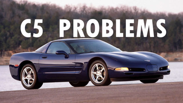
6 Common C5 Corvette Failures and What's Involved In Repairing Them
Pouria Savadkouei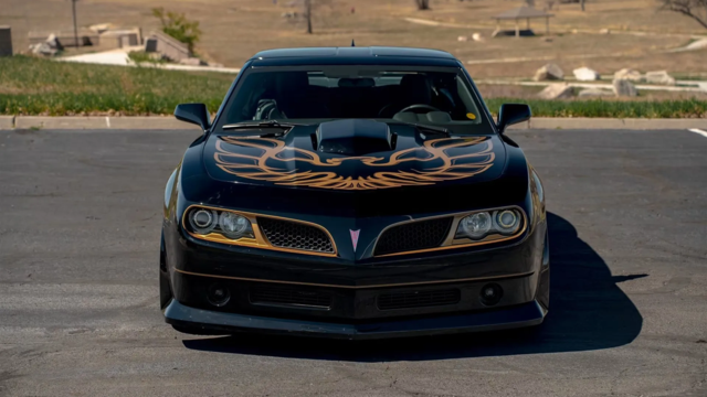
Retro Modern Bandit Pontiac Trans AM Comes With Burt Reynolds' Autograph
Verdad Gallardo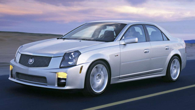
Top 10 Greatest Cadillac V Series Performance Models Ever, Ranked
Pouria Savadkouei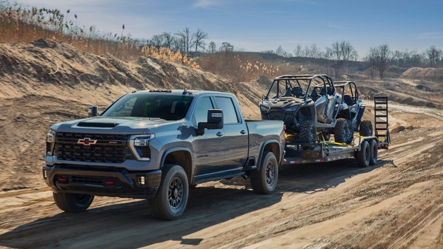
Top 10 Most Powerful Chevy Trucks Ever Made!
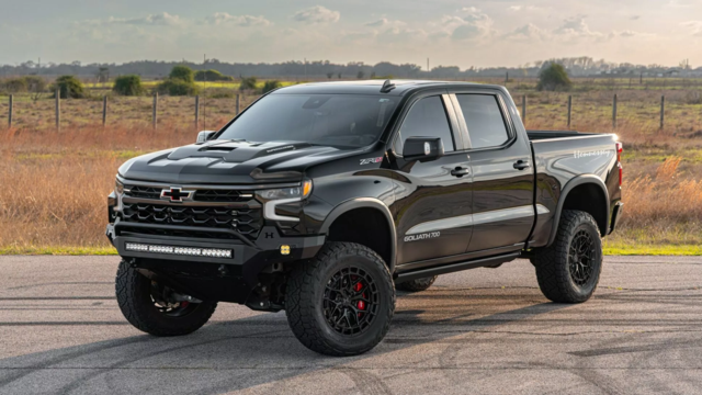
Hennessey's New Supercharged Silverado ZR2 Has 700 HP
Verdad Gallardo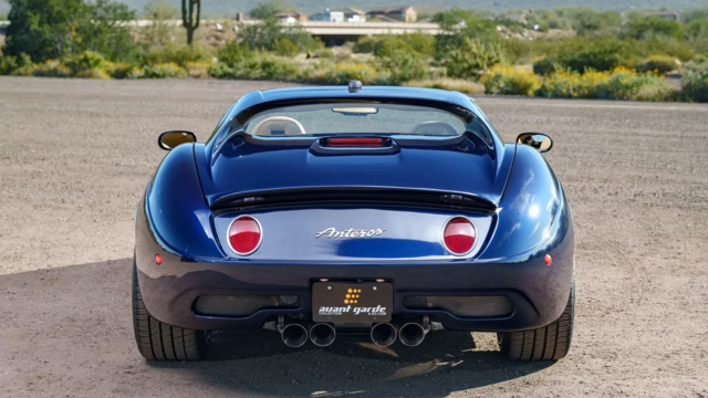
Coachbuilt N2A Anteros Is an LS2-Powered C6 Corvette In Italian Clothes
Verdad Gallardo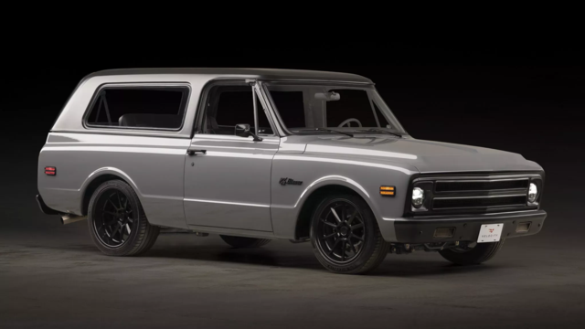
Awesome K5 Blazer Restomod Comes With C7 Corvette Power
Verdad Gallardo
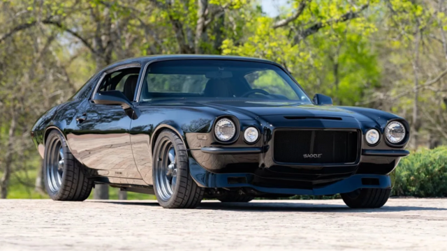
10 Camaros You Should Never Buy
10 LS Engine Myths That Refuse to Die
Verdad Gallardo Thread Starter
Teching In
Joined: Apr 2002
Posts: 2
Likes: 0
From: St. Petersburg FL
</font><blockquote><font size="1" face="Verdana, Helvetica, sans-serif">quote:</font><hr /><font size="2" face="Verdana, Helvetica, sans-serif">Originally posted by WEASEL:
<strong>The paint looks good but the windshield banner is distracting. It doesn't really go with the paint since it's so bright.
If you removed the banner or had it in one of the darker blues on the car then I think it would look perfect. <img border="0" title="" alt="[Smile]" src="gr_stretch.gif" /> </strong></font><hr /></blockquote><font size="2" face="Verdana, Helvetica, sans-serif">Thanks, WEASEL, I concur. It's the same red as the flame tips, and the Chevrolet accents, but it would look better in blue.
Thanks guys. I got it on the SLP 2002 calendar (with the original scheme), and got 2 "Top Award" trophies at local car shows with the additional flames, but sometimes there's an idea or two you miss.

I think the paint job is awesome! I agree with the idea of loosing the banner or using blue, just like they said, it's kinda distracting. Also, have you thought about some sort of billet wheels? They probably wouldn't stand out as much as chrome but would still be super clean, just my .02, but I love the paint!
Damn, these other guys and I think alike! I didn't even read their comments until I looked for myself.
Lose the windshield banner. Those make a car look "cheap" in my opinion.
Get some badass wheels to match the paint. Stock SS rims are overdone and boring and really only look decent on an otherwise stock car.
I like the flames and their colors, but I don't like them going past the front fender and onto the doors. That large gray flame in the middle of the door is distracting also, it doesn't match the other flames and it stands out too much. Just my observation
Tony