Appearance & Detailing Interior & Exterior Appearance Modifications

check this out!!!!!!

Thread Tools
 
Search this Thread
 
Old 02-02-2006 | 06:43 PM
  #21  
meissenation's Avatar
TECH Fanatic

iTrader: (2)
 
Joined: Apr 2004
Posts: 1,634
Likes: 2
From: Macomb Twp, MI
Default

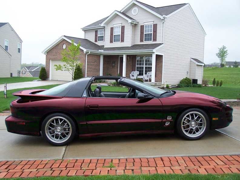
It's interesting, but there's a few flaws in the execution of the paint scheme, which is what I have a problem with. First off, I don't like the rims. Chrome or andonized red rims would've been better. The paint scheme itself is interesting, but what (s)he should've done is continued the silver from the rear hatch to the door or something to that effect. The fact that the hatch was painted silver to create the "two one" is what makes it not look right. If it continued into the rear quarter panels along the lines of the B-pillar and near the window, that would've been a little better. Overall, interesting idea, not too bad, just needs a little better execution of the paint job.
Old 02-02-2006 | 07:02 PM
  #22  
Sgt. Spuds's Avatar
Shirley Temple Drinker
iTrader: (1)
 
Joined: Oct 2005
Posts: 3,333
Likes: 0
From: IL
Default

I'd drive it... The work looks to be good, and the colors DEFFINATLY go....

But I'd rather have a black or white one
Old 02-02-2006 | 08:47 PM
  #23  
227Hawk's Avatar
TECH Fanatic
iTrader: (1)
 
Joined: Nov 2001
Posts: 1,735
Likes: 0
From: Turlock, Ca
Default

It's Different.
Hawk
Old 02-02-2006 | 09:21 PM
  #24  
Black Z/28's Avatar
TECH Fanatic
 
Joined: Jan 2003
Posts: 1,094
Likes: 0
From: Northern Va
Default

I like the color of the POS house. Looks like he's trying to color coordinate.

Old 02-02-2006 | 09:40 PM
  #25  
y2k_ta's Avatar
'Bird Director
20 Year Member
iTrader: (80)
 
Joined: Dec 2001
Posts: 12,824
Likes: 27
From: Central Indiana Honors: 4th grade spelling bee contestant
Default

I like it....and no the only taste I have is not in my mouth
Old 02-02-2006 | 09:45 PM
  #26  
Louie83's Avatar
TECH Fanatic

iTrader: (3)
 
Joined: Jun 2004
Posts: 1,844
Likes: 0
From: Dayton, OH
Default

Originally Posted by Bird-Of-Prey
I had thought about doing something similar to mine but more styled after the camaro. I posted a thread about it a while back and got some pretty good comments. Haven't really thought too much more about it just tossing around ideas. Here was my photochop.
Quit *****-footin' around and do it.
Old 02-02-2006 | 09:50 PM
  #27  
ProjecT 9's Avatar
TECH Fanatic

iTrader: (6)
 
Joined: Mar 2004
Posts: 1,235
Likes: 0
From: Houston
Default

looks like that impala in front of it has the same paint job
Old 02-02-2006 | 11:09 PM
  #28  
DirtyBird222's Avatar
Banned
iTrader: (7)
 
Joined: Jun 2005
Posts: 2,633
Likes: 0
From: Longwood/UCF, Fl
Default

would look so much better if it was blended and even. Maybe bring that pewter/silver color down a couple inches with a black like seperating the colors! It looks like that guy just switched body panels on the top!
Old 02-15-2006 | 01:15 PM
  #29  
01bird58's Avatar
12 Second Club

iTrader: (9)
 
Joined: Jul 2005
Posts: 1,108
Likes: 0
From: Rockland County, NY
Default

[QUOTE=GotV-8]Umm no. The car badass. If it had five different colors on it I could see what you are saying but it dont.[/QU


The car is ruined, your reading too technically into what I wrote, I was making a laughable comparison to it.
Old 02-15-2006 | 01:50 PM
  #30  
1 BAD BIRD's Avatar
TECH Resident
iTrader: (3)
 
Joined: Nov 2001
Posts: 909
Likes: 0
From: Lititz PA
Default

Originally Posted by Louie83
Quit *****-footin' around and do it.
You better do it before I do

Bob s.


All times are GMT -5. The time now is 03:28 PM.