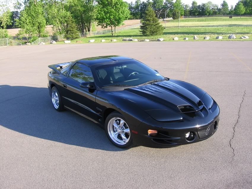
Pick my PIC for Popular Hotrodding Magazine...
#25
I say 4, 5, or 8 depending on the look you want to convey:
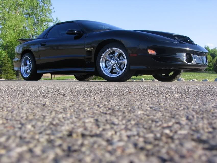
This says, "I'm bad ***"

This shows all your car has to offer and looks like a "Reader's Rides" pic..
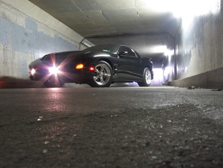
This pic looks like the car is stealing your soul as you stare at it !
!
EDIT: Just photoshop the window decals out !
!

This says, "I'm bad ***"


This shows all your car has to offer and looks like a "Reader's Rides" pic..

This pic looks like the car is stealing your soul as you stare at it
 !
!EDIT: Just photoshop the window decals out
 !
!
#35
The problem with 5 is the lighting. It distorts in the interior with shadows and the only reason its so popular is because its the only shot where your stripes are clearly visible. However, the first picture you sent them already clearly shows your stripes, so that shouldnt be a primary concern. (Atleast I wouldnt think so.) Not to mention, the background does nothing to compliment your car.
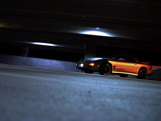
IMO, the last shot is the best of the bunch. It would grab my attention faster because of its dark and cool appeal. It also matches the theme you've set with the first photograph, sustaining that 'menacing' look. And its one of the only shots that looks like it was snapped for a photoshoot by a professional, whereas the others look like normal photos, including 5.
Just my .02 as an artist. Either way, nice ride, and good luck.
edit: it really does look like the last shot and the first shot you selected on the ramp are part of a series. im not sure if its the case, but it seems that the last shot was taken after going down that ramp? atleast that would be the perception when compared. lol just something i noticed.
IMO, the last shot is the best of the bunch. It would grab my attention faster because of its dark and cool appeal. It also matches the theme you've set with the first photograph, sustaining that 'menacing' look. And its one of the only shots that looks like it was snapped for a photoshoot by a professional, whereas the others look like normal photos, including 5.
Just my .02 as an artist.
 Either way, nice ride, and good luck.
edit: it really does look like the last shot and the first shot you selected on the ramp are part of a series. im not sure if its the case, but it seems that the last shot was taken after going down that ramp? atleast that would be the perception when compared. lol just something i noticed.
#36
Originally Posted by SaintNJ
The problem with 5 is the lighting. It distorts in the interior with shadows and the only reason its so popular is because its the only shot where your stripes are clearly visible. However, the first picture you sent them already clearly shows your stripes, so that shouldnt be a primary concern. (Atleast I wouldnt think so.) Not to mention, the background does nothing to compliment your car.
IMO, the last shot is the best of the bunch. It would grab my attention faster because of its dark and cool appeal. It also matches the theme you've set with the first photograph, sustaining that 'menacing' look. And its one of the only shots that looks like it was snapped for a photoshoot by a professional, whereas the others look like normal photos, including 5.
Just my .02 as an artist. Either way, nice ride, and good luck.
edit: it really does look like the last shot and the first shot you selected on the ramp are part of a series. im not sure if its the case, but it seems that the last shot was taken after going down that ramp? atleast that would be the perception when compared. lol just something i noticed.
IMO, the last shot is the best of the bunch. It would grab my attention faster because of its dark and cool appeal. It also matches the theme you've set with the first photograph, sustaining that 'menacing' look. And its one of the only shots that looks like it was snapped for a photoshoot by a professional, whereas the others look like normal photos, including 5.
Just my .02 as an artist.
 Either way, nice ride, and good luck.
edit: it really does look like the last shot and the first shot you selected on the ramp are part of a series. im not sure if its the case, but it seems that the last shot was taken after going down that ramp? atleast that would be the perception when compared. lol just something i noticed.
#37
Not a bad idea. I just dont think a parking lot with frilly green trees and what almost looks like a basketball court make your car look like its gonna melt faces.  You need the death stare. And as you can see, i like parking garages too..
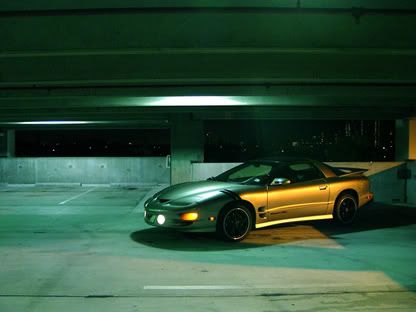
 good luck.
 You need the death stare. And as you can see, i like parking garages too..

 good luck.


