


Updated CLEARER pics....
Originally Posted by brynnda
he prolly has those seat coors on there, not to impress anyone, but to keep his leather in good shape. hell i have rubber floor mats in my car to protect my carpet, and im lookin for tan seat covers.
TECH Apprentice
Joined: Jan 2006
Posts: 381
Likes: 0
From: Hampton, VA
hmm, if ur askin for honest opinions - i'd say pick a theme and stick with it. looks like ur main theme is the dark/blackout, but the wheels arent helpin it..along with the badge. i'd just suggest u blackout the wheels, and if u can, maybe black out the 350 badge? ur paint looks like sex tho.. really an incredible job on the upkeep of ur paint! 
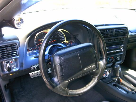
as far as the interior goes - almost sex. just one thing i aint feelin - the paint, i think u shuld maybe pinstrip the blue on all the plastic. like, for instance, maybe paint a medium-thick blue pinstripe on the outermost part of the trim panels all the way around (including doors) as opposed to painting the whole piece. i think that wuld constitute definate sex. the seat covers - eh, they serve their purpose, an if they really dont bother u, then oh well.
i'm all for keepin wut u got (including the badge an everything), just...maybe change the color scheme up a wee bit. just my honest opinion dude. u really do have a beautiful car tho. major props for keepin her clean...and unique!
Thread Starter
12 Second Club
iTrader: (7)
Joined: Oct 2005
Posts: 1,018
Likes: 0
From: Englewood, CO
Originally Posted by Red99TA
WTF is up w/ those exhaust tips? Sorry just don't like 'em at all (they stick out too much IMO)
Umm, they are a part of the hooker catback, which is installed fully and correctly. i dont know why they would look wrong. maybe its the angle of the pics....
Man, that car looks familiar... I don't know why though... oh wait:


Granted, I got rid of my Halos, but still similar all around:

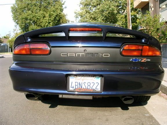
Your Hooker tips are adjusted too far out though... Are your hockey stripes painted on?
Granted, I got rid of my Halos, but still similar all around:
Your Hooker tips are adjusted too far out though... Are your hockey stripes painted on?
LS1 Tech Stories
The Best V8 Stories One Small Block at Time

Topdon ONE vs. Artidiag 800 BT2: Which is the Diagnostic Tablet For You?
Pouria Savadkouei
Gas Monkey Built a 6-Wheel Ferrari Testarossa With a Corvette LT4 Engine
Verdad Gallardo
7 Most Reliable High-Performance Engines GM Has Ever Built
Verdad Gallardo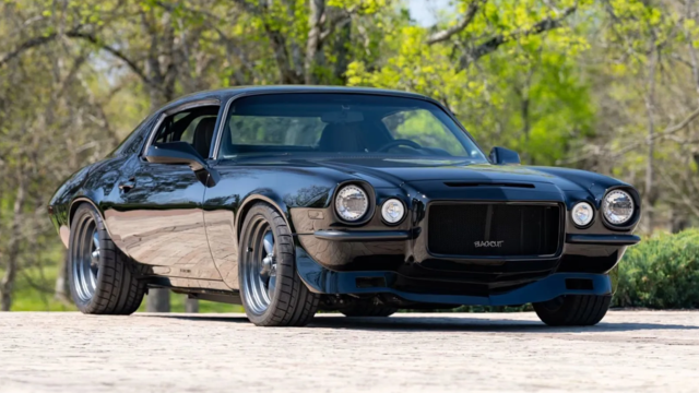
Amazing '71 Camaro Restomod Is Modern Muscle Car Under the Skin
Verdad Gallardo
6 Common C5 Corvette Failures and What's Involved In Repairing Them
Pouria Savadkouei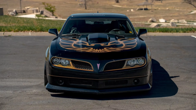
Retro Modern Bandit Pontiac Trans AM Comes With Burt Reynolds' Autograph
Verdad Gallardo
Top 10 Greatest Cadillac V Series Performance Models Ever, Ranked
Pouria Savadkouei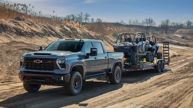
Top 10 Most Powerful Chevy Trucks Ever Made!
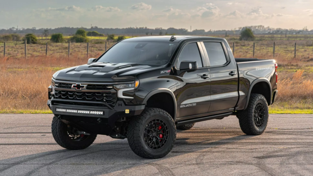
Hennessey's New Supercharged Silverado ZR2 Has 700 HP
Verdad Gallardo Oh, and for the record (in your defense) those V-Flags came on CAMAROS as well 1967-(68 or 69, not sure)... All one has to do is open the Year One catalog to see that...
I am still considering putting one on the driver's side of the Berger panel to balance it out...
I am still considering putting one on the driver's side of the Berger panel to balance it out...

TECH Resident
Joined: Oct 2005
Posts: 812
Likes: 0
Originally Posted by DEMONBIRD
Man, that car looks familiar... I don't know why though... oh wait:
You Hooker tips are adjusted too far out though... Are your hockey stripes painted on?
You Hooker tips are adjusted too far out though... Are your hockey stripes painted on?

TECH Resident
Joined: Oct 2005
Posts: 812
Likes: 0
Originally Posted by 99_Z_155
As far as i know, the tips are on all the way. i could be wrong. show me some pics of other hooker tips please....


Originally Posted by bone324
But I wouldn't expect alot of positive feedback on this forum.
Originally Posted by 99_Z_155
Ain't that the truth? It's not an SS with torque thrusts, Corsa tips, an a perfect Berger panel

If you like your theme then thats cool and it looks good. But I do think you need some different wheels to match. Maybe some torque thrusts?
Opinions are like ********, everyone has one so take what I say with a grain of salt.
I dig the front grill. You went with a black grill and even though the bowtie doesn't match your paint, it shows a bit of nostalgia without going overboard.
The 350 badges stick out like sore thumbs on that nice dark paint and the motor is not a 350 no matter how many people refer to it that way. Fight the ignorance with correct badging, look at it as a way to educate the un-informed. Not only that but the the first thing that I see when looking at the front of the car is how far out the 350 badges stick out from the natural curve of the car. Even if you went with a 346 badge I would recommend going with something slimmer like a decal and matching it to the black hockey stripe that you've got. The blocky badges worked well on the front fender of classic cars, just not so much on the lines of a 4th gen.
I realize the flags emblems are nostalgic to the classic cars and that's where you are trying to go with your styling, but they do not go well at all just slapped on the sailpanel against the black paint.
You did a good job on filling in the Camaro lettering on the back panel and painted it up nicely only to slap a poorly placed Camaro badge and a big *** blue bowtie that's not even placed tastefully underneath the taillight. You have 5 different colors on the back on your car and that's not including the plate. It kind of looks like you just had a couple left over badges and decided to stick them somewhere instead of letting them collect dust in your garage or selling them to another member.
The exhaust tips do stick out pretty far (if you can see them clearly in the reflection of your bumper, it means that they stick out too far). One another thing about them, I thought the stagger tips should flow with the bumper (long ones on the inside and the short ones on the outside to follow the lines of the bumper).
Again, it's just an opinion.
