General Motors Has a New Logo to Match New EV Attitude
For only the fifth time in General Motors’ history, they’ve changed their logo. This is what they came up with.
Companies are always striving to be on the cutting edge of change. And it is that very spirit that motivates evolution; both good and bad. For every C8 Corvette success, there is a contrasting Chevrolet SSR. Sometimes they get it right, and sometimes they miss the mark.
So when GM debuted its new logo this week, we could only think of the latter. The rebranding is part of a new “Everybody In” campaign that affirms GM’s commitment to electric vehicles.
“There are moments in history when everything changes. Inflection points. We believe such a point is upon us for the mass adoption of electric vehicles,” said Deborah Wahl, GM global chief marketing officer, in a recent press statement. “Unlike ever before, we have the solutions, capability, technology and scale to put everyone in an EV. Our new brand identity and campaign are designed to reflect this.”
The “Everybody In” campaign focuses on three themes: Getting a new generation of buyers interested EVs; demonstrating GM’s EV plans, and highlighting the range, performance, and flexibility of the Ultium platform.
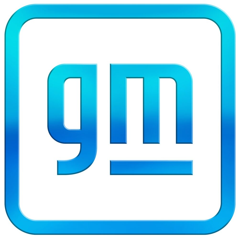
Designed in-house, the new logo now features “gm” (in lowercase letters), with the “m” is underlined. This refers to the Ultium battery cell platform that will underpin its new EVs. And within the negative space of the “m” there is a nod to the shape of an electrical plug.
Transforming the world begins with transforming ourselves.
Posted by General Motors on Friday, January 8, 2021
It is a big change for the automaker, and only the fifth time GM has changed its logo since 1908.
And we aren’t going to lie. Truthfully, we feel a little (okay, a lot) underwhelmed by the new look. Sure, we understand the reasoning behind the new look and campaign. To stay relevant and survive in the changing auto market, all automakers need to embrace electric vehicles. So yes, GM needs to reach out not just to consumers; but to all industries that play a part in electrification. Going with this look they capture a certain digital, cyber vibe.
However, the bottom line is this: No.
By that we mean, this doesn’t feel like an automaker’s logo. And it definitely feels anemic for the automaker that brought us the Camaro, Silverado, and Corvette.
Got thoughts on the logo? Let us know!
Photos: General Motors