


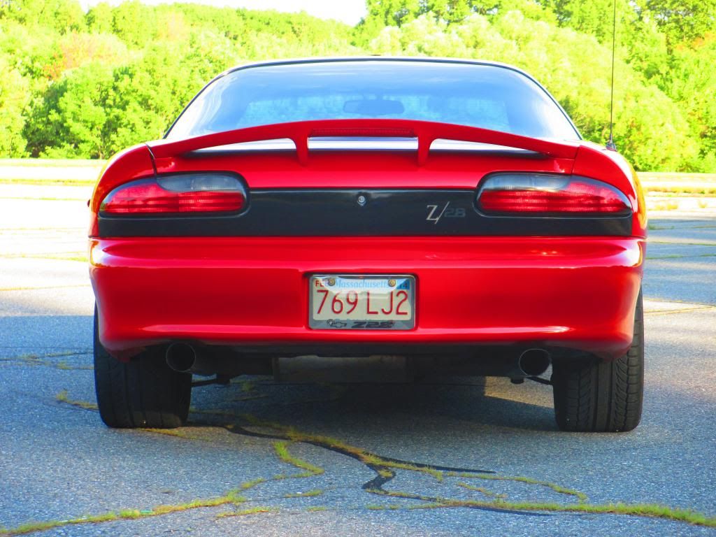
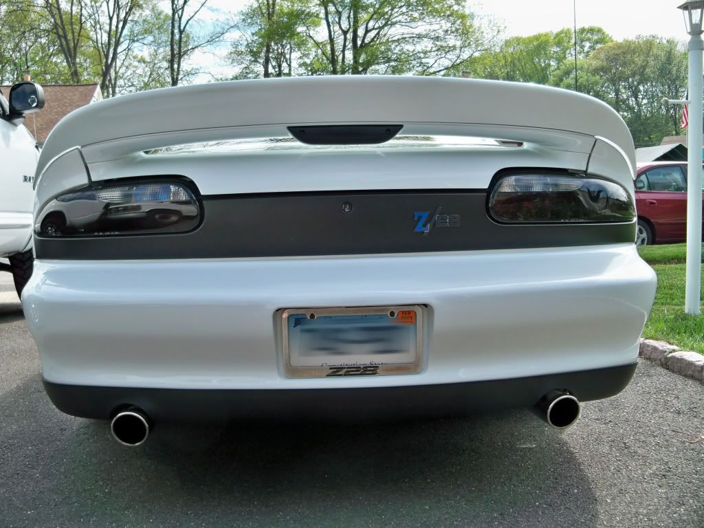
New Z28 badge,
Nothing wrong with doing something different. As far as the out of place thing, I think it a bit too close to the light. Feel it'd look better 1-2 inches to the left. And I think it'd look drastically better with the key hole removed, because it being there, combined with the placement of the badge really gives the panel an oddly cluttered/disorganized look in that area on an otherwise really clean panel.
If you enjoy it though, that's all that matters
If you enjoy it though, that's all that matters
never mind what I said about the badge placement.. I think it looks fine, just get rid of the key hole! here's a quick PS (gave the black
a bit of a deeper color as well)
it's the little details that make all the difference

a bit of a deeper color as well)
it's the little details that make all the difference

Trending Topics
LS1 Tech Stories
The Best V8 Stories One Small Block at Time

Topdon ONE vs. Artidiag 800 BT2: Which is the Diagnostic Tablet For You?
Pouria Savadkouei
Gas Monkey Built a 6-Wheel Ferrari Testarossa With a Corvette LT4 Engine
Verdad Gallardo
7 Most Reliable High-Performance Engines GM Has Ever Built
Verdad Gallardo
Amazing '71 Camaro Restomod Is Modern Muscle Car Under the Skin
Verdad Gallardo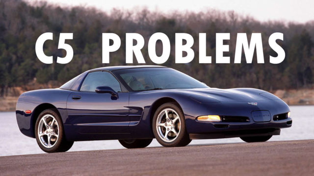
6 Common C5 Corvette Failures and What's Involved In Repairing Them
Pouria Savadkouei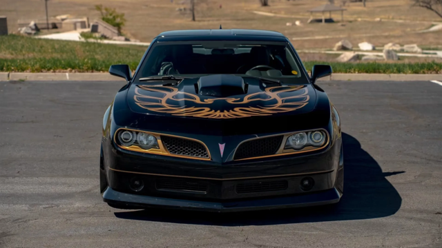
Retro Modern Bandit Pontiac Trans AM Comes With Burt Reynolds' Autograph
Verdad Gallardo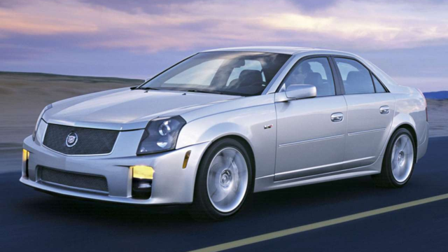
Top 10 Greatest Cadillac V Series Performance Models Ever, Ranked
Pouria Savadkouei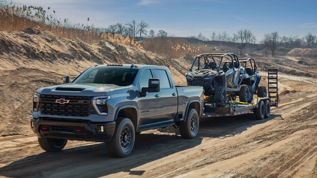
Top 10 Most Powerful Chevy Trucks Ever Made!
Hennessey's New Supercharged Silverado ZR2 Has 700 HP
Verdad Gallardo
Thread Starter
TECH Enthusiast
Joined: Feb 2012
Posts: 541
Likes: 1
From: Mass
BFGoodrich gForce Sport

^^^ Much better placement.. fyi WS6store I believe has smooth lock covers in glossy black that are adhesive and stick pretty well to the locks. I used to have some they were nice. That way you don't have to bondo over the lock area etc.
Thread Starter
TECH Enthusiast
Joined: Feb 2012
Posts: 541
Likes: 1
From: Mass
Actually yours was the inspiration for it. I liked the fact that the color of the badge was different than the car itself
